Bissell Centre
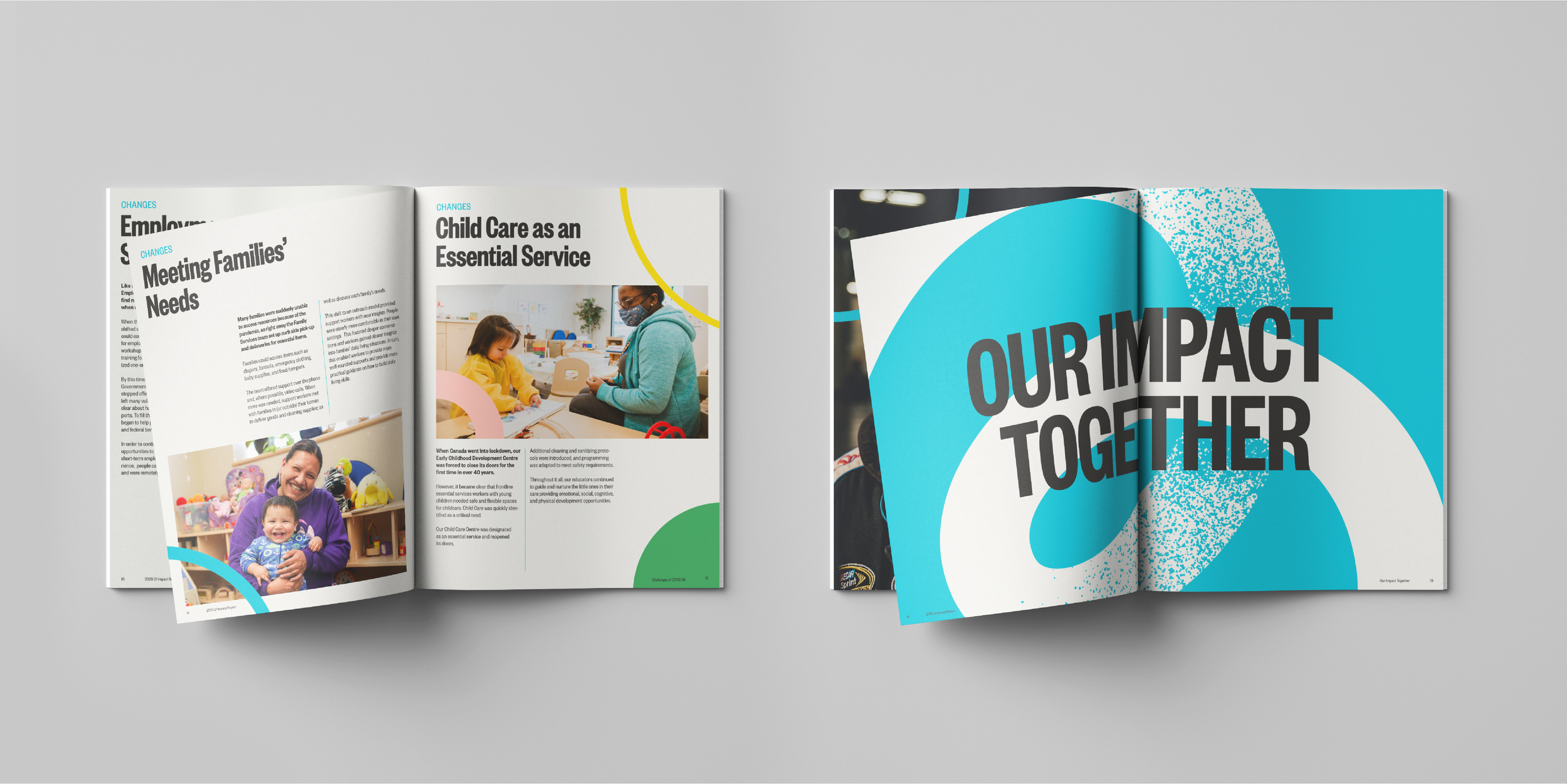
Bissell is one of the most recognizable charitable organizations in Edmonton, Alberta. It provides a critical service to Edmonton's vulnerable population. I was approached to help uncover and amplify a new found sense of identity within the organization, something that would be emblematic of the passion and dedication of their staff, the courage and resilience of their participants, and the care and compassion of their community of supporters.
Year:
2021
Client:
The Bissell Centre
Services:
Design Strategy, Identity, Print Design, Art Direction.
Industry:
Charity
Background
Edmonton’s vulnerable population had enough to navigate without Covid adding another layer of complexity. Bissell did what it does best — take care of people. During this heightened time of need, Bissell found a renewed sense of identity. Their purpose became so clear because it was right there, unavoidably obvious.
“We believe the elimination of poverty in our community is possible. But it will take the whole community. Creating lasting change and meaningful impact will require a commitment to collaboration, openness to diverse perspectives, unrelenting dedication—and a whole lot of heart. This is the essence of our new brand.” ~ Bissell.
We used this energy to inform the brand evolution. We leveraged the recognizable and distinct Bissell blue and set out to craft a warmer, bolder and more confident visual identity. We did this by softening the form of the Bissell B into a heart shape, adding a gritty texture to create depth and to create a sense of authority we introduced a news-print inspired typographic language.


